BEFORE | AFTERS
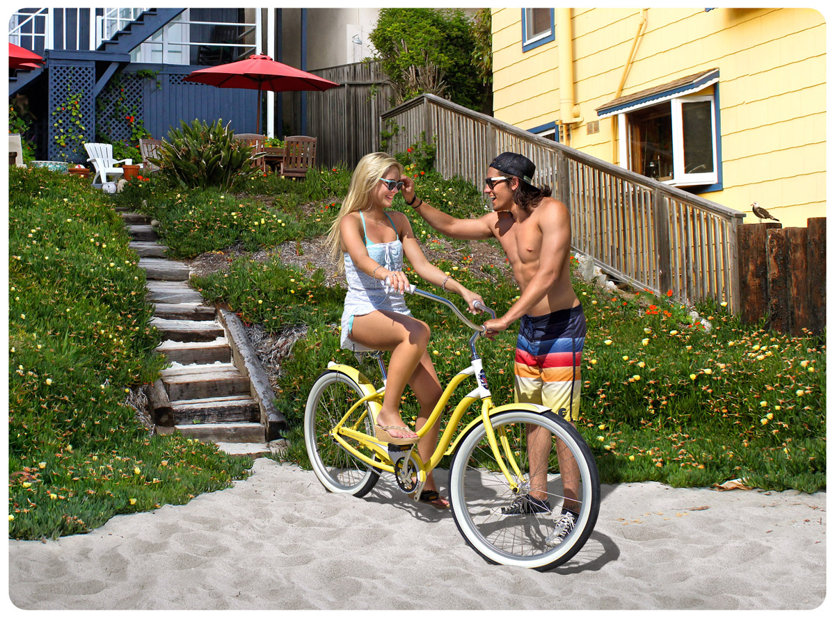
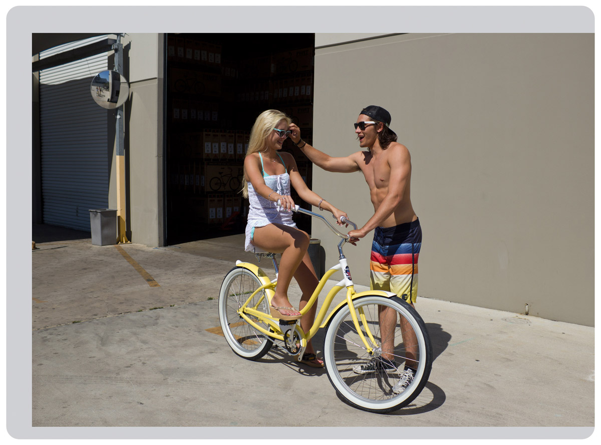
LOCATION FAIL... We were all set up to shoot, with the models, bikes, props, etc... when we got the boot. (We shot guerrilla style - no permits!) Luckily, I had taken some test shots of the models at the warehouse (while matching them up with their bikes) and also while location scouting. The catalog deadline was looming, and we still needed an image with that specific bike in it for product placement. The test shots (and magic) saved the day!
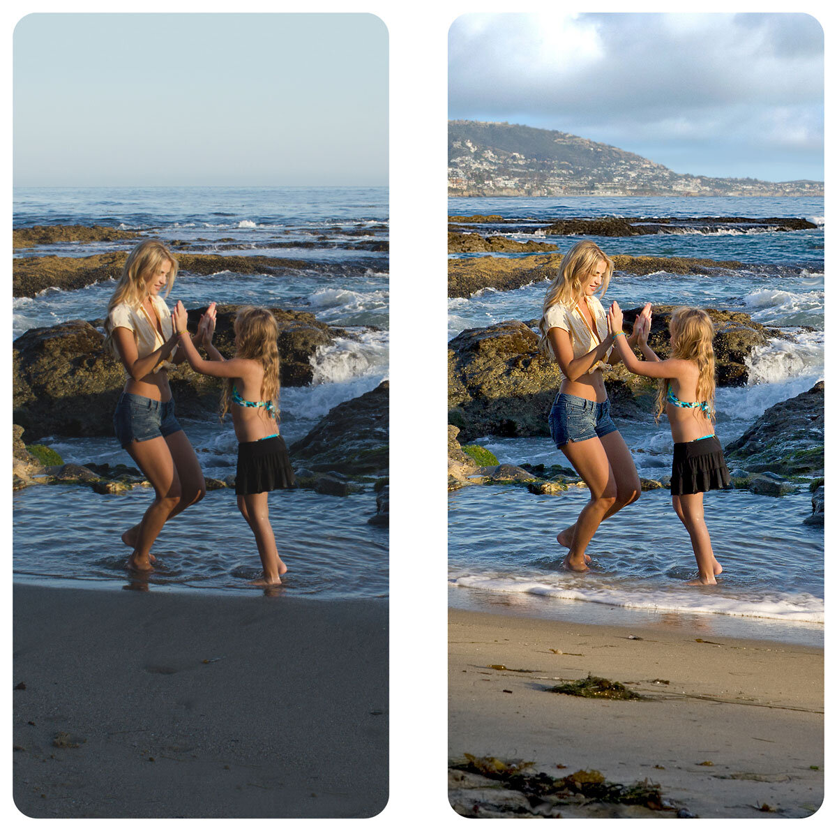
MOMMY & ME… All Phat Cycles catalogs had a “mini” image - to accompany a full page image on the right. These images all needed to fit within a narrow crop. In this case, other parts of the background were lost, so I shifted the shoreline in the distance around to the right. The sun was going down fast… so I added foreground (and sky) from previous shots, to add more interest and recapture some of the earlier sparkle.

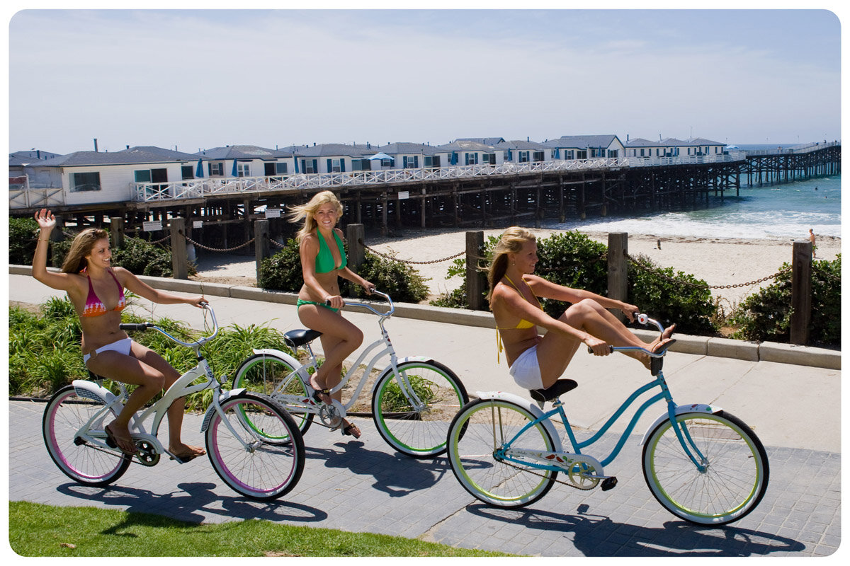
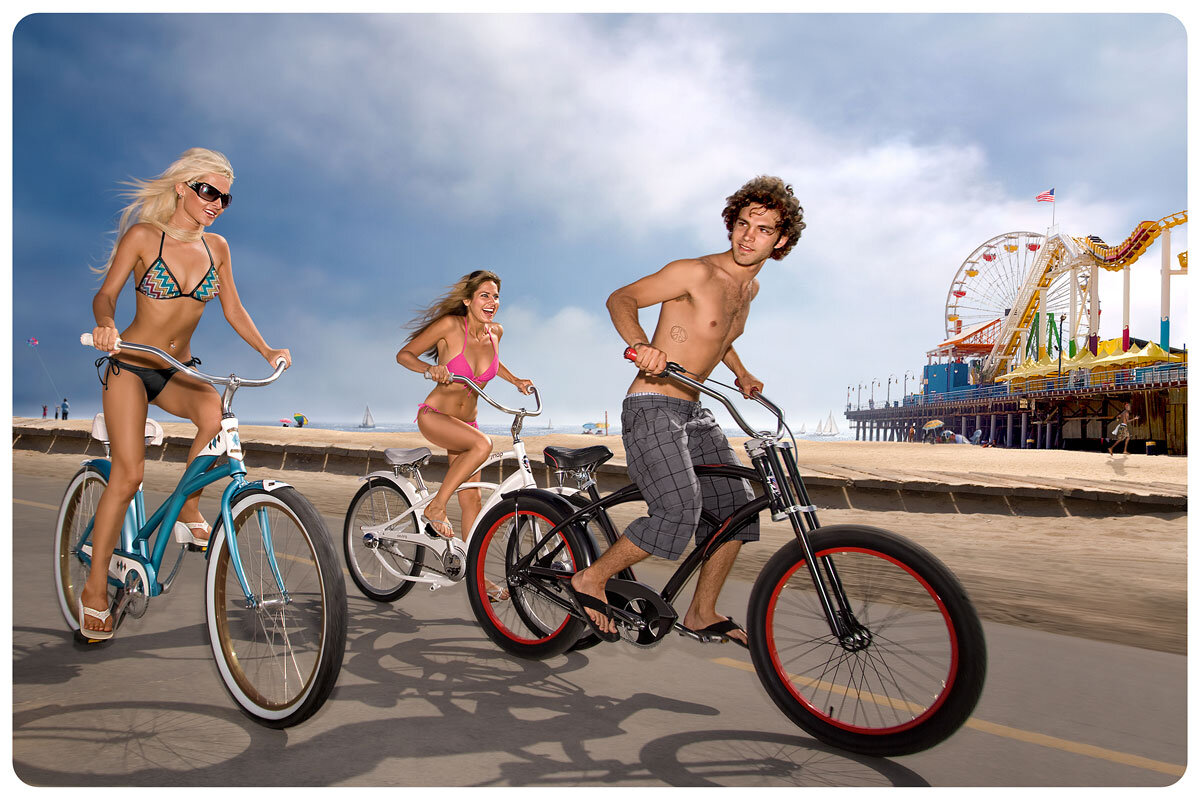
BRIGHTER DAYS… Weak Cover / Bad Lighting. This image was chosen for the catalog cover, but was lackluster compared to the lifestyle images inside. The pier in the original photo was too prominent, so I started mashing it up. I moved the pier to the left and scaled it down, opening up the view. The clouds came from another shot earlier in the day. For the final touch, the lighting on the bikes and girls in the foreground was pumped up. We used bounce boards to direct sunlight onto the models and bikes, but it was hard to get it all timed right - since they were in motion... We were just lucky they didn't crash into each other!
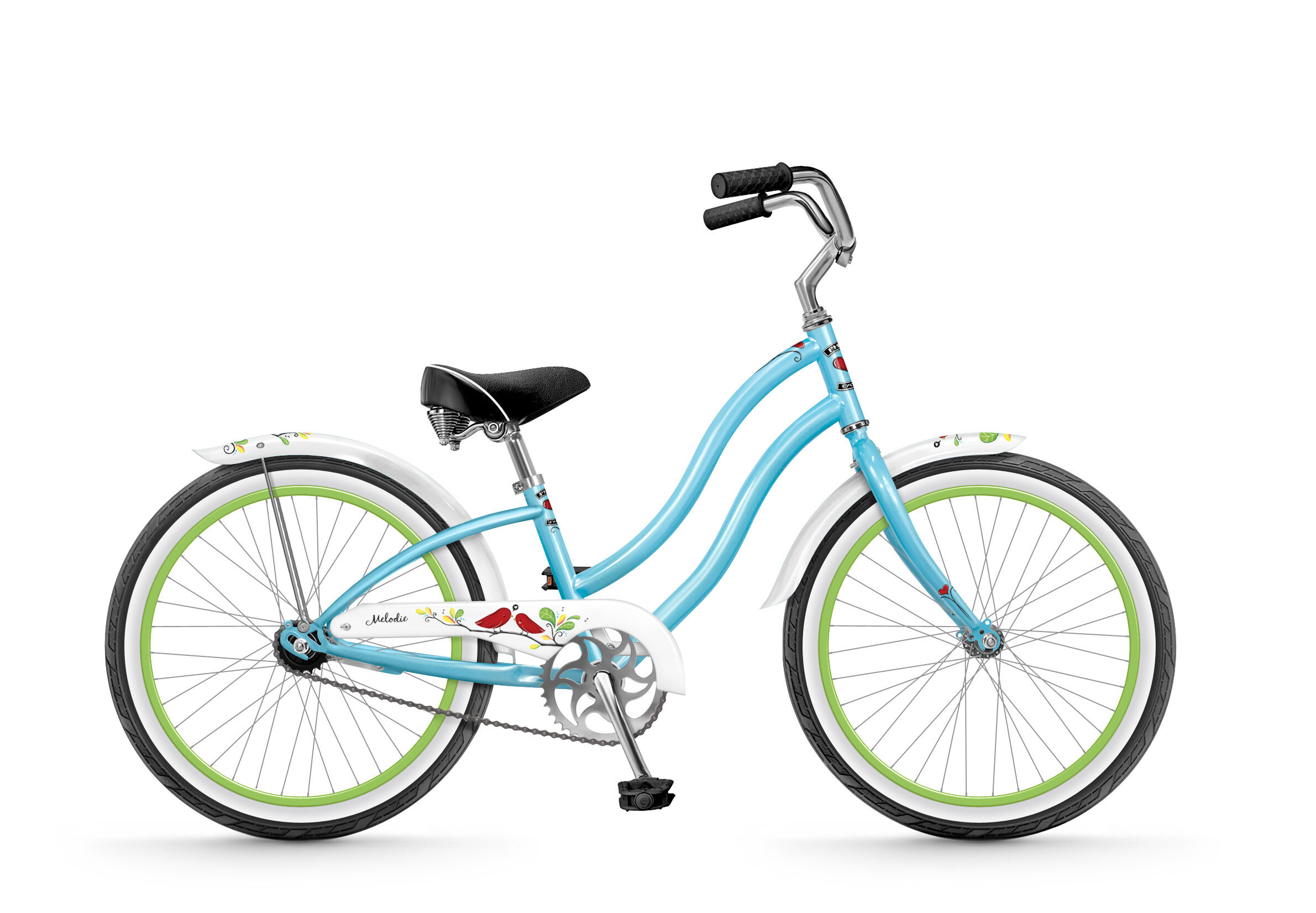
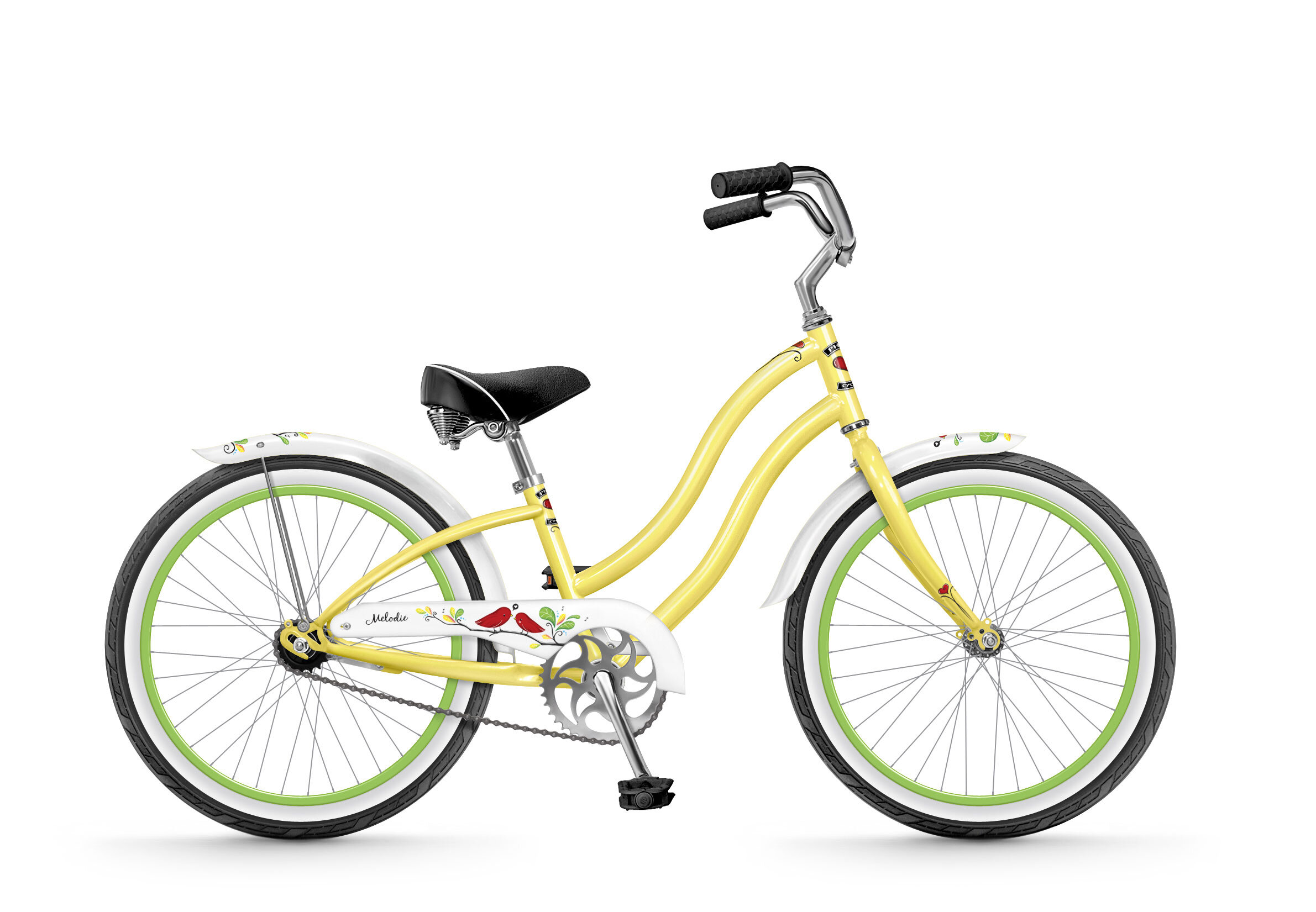
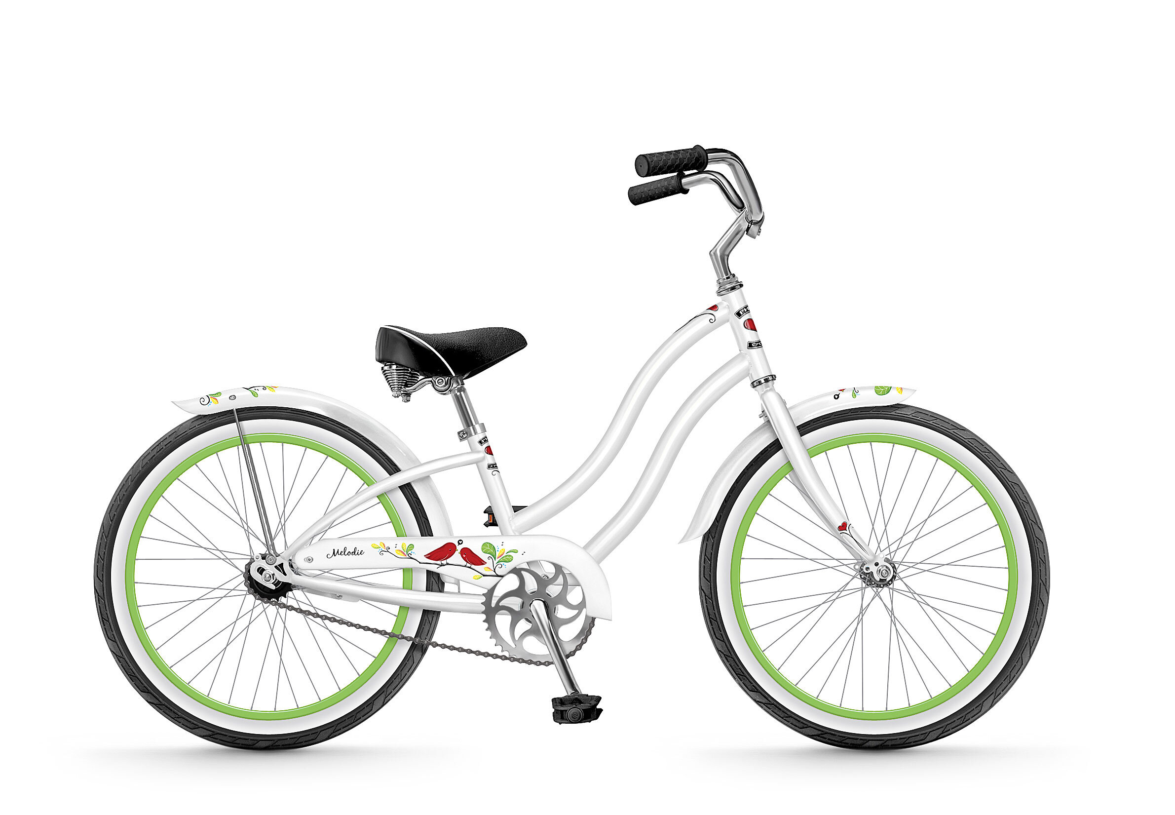
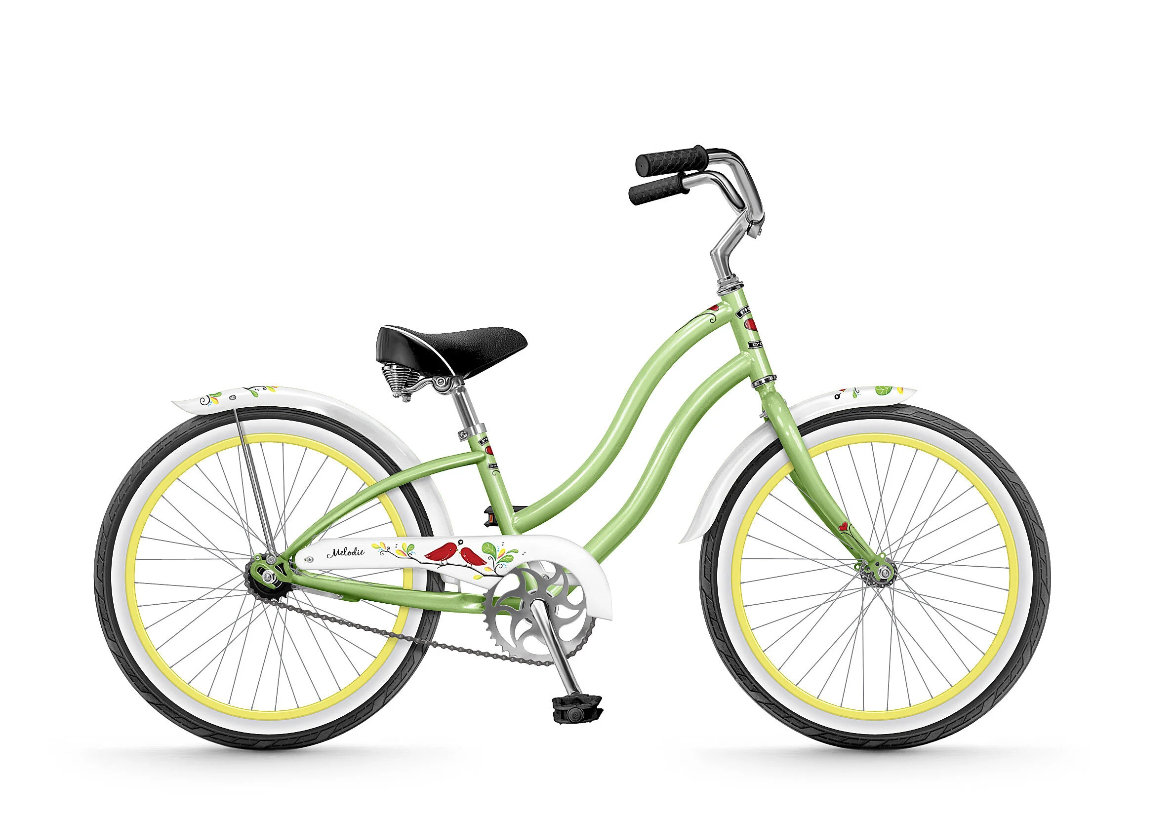
CUTE LITTLE FRANKENSTEIN… Despite the best laid plans, new sample bikes did not always arrive in time. So I had to make do with what was available. In this case I took a quick photo of a previous model to get the basic layout and parts. The geometry of the frame had changed, so I worked with the new frame drawing as an overlay and adjusted the image accordingly. The head tube was shorter, the tires changed and the fenders were also shorter (amongst many other ongoing spec changes). I ran out to the warehouse to photograph missing parts as the samples arrived. When I was finished with all that, I made versions of each colour-way for the website, catalog and factory guides. Original image is shown at the end. (This is the 20” version… Two of the 26” versions are shown in the Lifestyle photo above.)
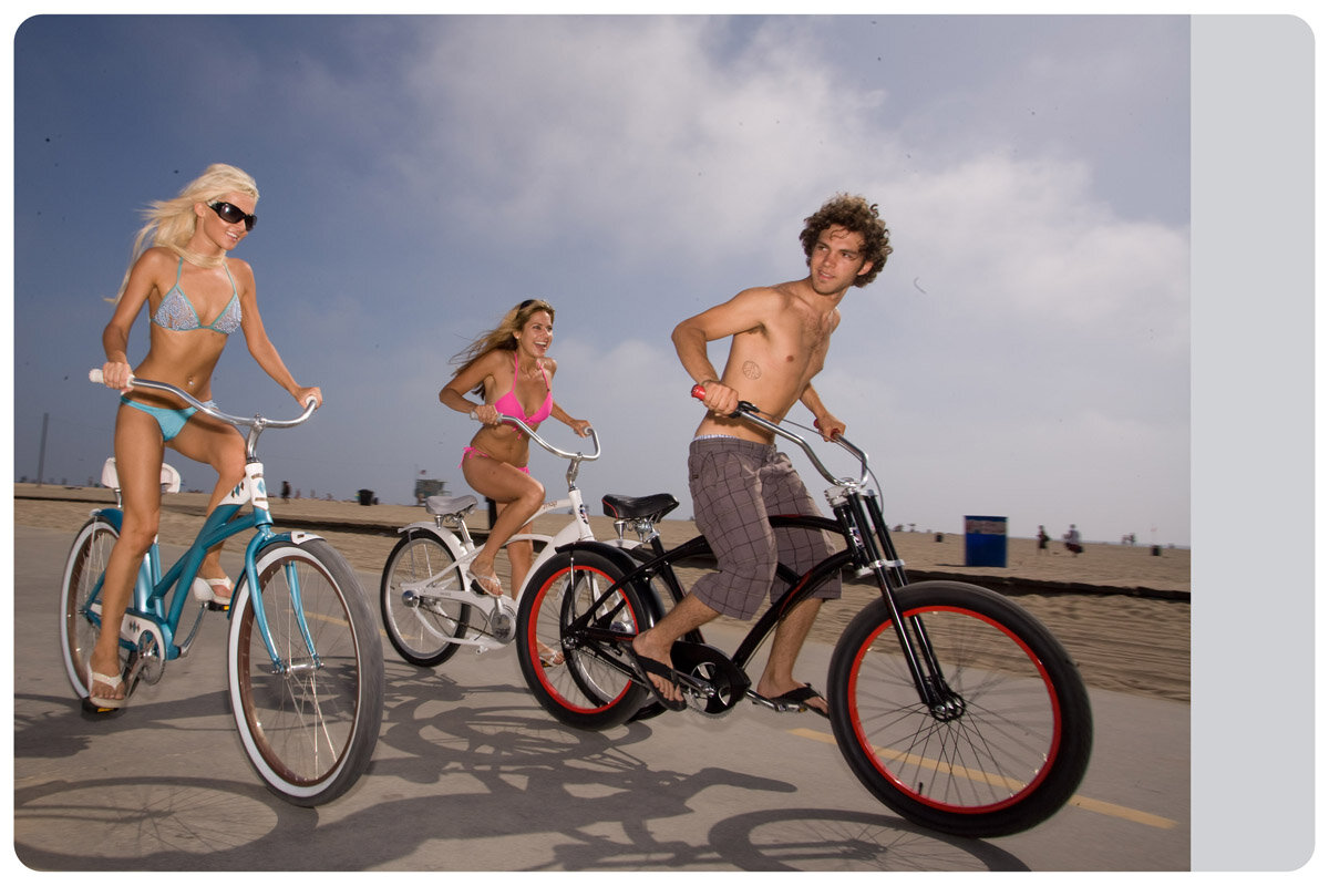
MISSING SPACE... Original image was too small. This image was also selected as a cover shot. But the photo wasn't wide enough and if enlarged, there wouldn't be enough room for the logo. This is another mashup, using elements from other photos in this sequence. The pier appeared in the next shots, just out of view in the original photo. One thing led to another... This was the beginning of Phat Land.
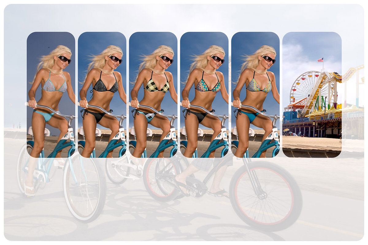
DIGITAL PAPER DOLLS… Evolution of a bathing suit. The original bathing suit on the left looked too much like lingerie. First, I took the easy road and made the suit black. It looked nice on it's own, but was unbalanced with the overall image and didn't look "fun". So I started borrowing suits : ) I hoped to find something to counterbalance the Pier on the right, yet still tie in with the bike. I added black ties at the hips (to help balance the sunglasses). Then I got fancy with the Buffalo Plaid. It was just too distracting, the blues conflicted and it was too monochromatic... so I changed the hue to yellow (the example here shows one of each top/bottom). It was still too distracting - like a bullseye, although I liked the yellow better. I really liked the happy colours on the abstract top (far right), but it wound up looking a little lost. The pattern wasn’t bold enough (no time to redesign a suit!) I settled on the Missoni pattern because it was more grounded.